Affiliate Disclosure: This post contains affiliate links. As I am a part of the eBay Partner Network and other programs, if you follow these links and make a purchase, I’ll receive commission. As an Amazon Associate, I earn from qualifying purchases.
Disclaimer: This is not buying or investment advice. I’m simply reporting the data I’m seeing. Please do your own research and make your own decisions. Just because cards have increased in value up to this point, it doesn’t mean they will continue to do so.
Any definition of error that you read will undoubtedly contain the word mistake or some synonym of mistake. And yes, while error baseball cards technically have something wrong with them from someone’s mistake, for me, they are the gift that keeps on giving.
One, many of them are some of the funniest baseball cards you’ll ever see. Others are ironic. These are grown men playing a kid’s game after all, so it’s only right we can chuckle every now and then. And then two, error cards give otherwise unexciting stacks of cards reason to live, and reason to be examined.
1989 Topps Error Cards
So, this will be the first of what will be hopefully an ongoing series of breaking down the different error (or, I guess, error and variation) cards found in a given set. And, thanks to the prevalence and mass production of anything between 1987-1992, we all have a stack of these laying around somewhere.
Thus, these 1989 Topps error cards are not valuable, and only worth a few bucks on a good day, but still fun to look at:
1. Bob Welch #605:
Topps “Welching” a Stat Line
Players with long histories in the game are said to be building “the back of their baseball cards.” Meaning, of course, that’s where all the featured player’s stats can be found, along with short stories, life facts, and other milestone mentions.
So, when any of those things are left off, it’s a big deal.
Bob Welch was a heck of a pitcher, and I’m not just saying that as a biased A’s fan. I mean, here is the back of his card from the last year he pitched:
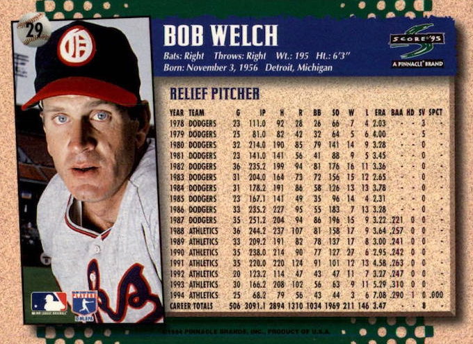
That’s a long, solid career!
Anyway, Topps was in agreement, and must have thought Welch’s career was so good that it needed no introduction:
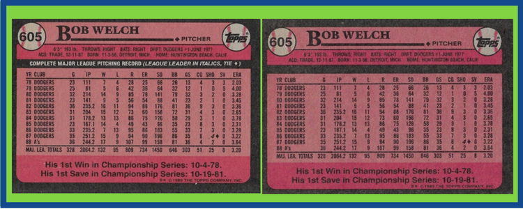
It’s not that Topps left off any part of Welch’s illustrious career, but rather, the line above the stats that introduces – and explains – the history (see the blank black line area) above where the stats begin.
2. Franklin Stubbs #697
A Little Bit of a (Non) Gray Area
Already a part of many blogs and articles about baseball cards thanks to the fact that he has one of the better names of anyone to play the game, Franklin Stubbs makes the 1989 Topps error list thanks to…well, his name, but the shading of his name versus the actual name itself.
You’ll see the gray vs. the white.
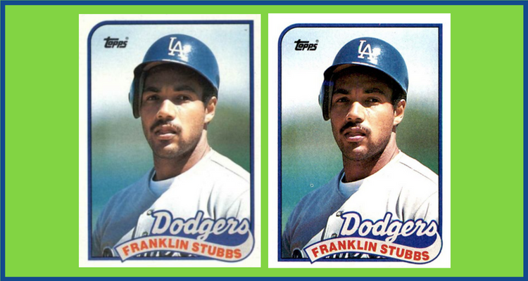
Not too fun or cool – which is on par for the junk wax era – but something that sticks out like a sore thumb on any 9-slot card album page.
3. Gregg Jefferies #233 (and all Future Stars)
Future Stars on Stilts
This error card was always weird to me, but I think I’ve come up with a plausible scenario.
“These are the future stars of baseball. Steve Searcy. Mike Harkey. The best of the best. We MUST make them appear as big as possible on these cards.”
And thus, the cards were printed with a lowered rectangle and overlaying “Future Stars” text, making the players appear huge, taking up most the card’s available area.
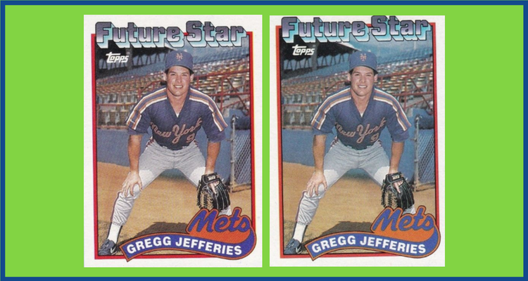
Technically, as mentioned above, these and many others are “variations” and not errors, as the printing could have been intended to displayed as shown, but then a change was made, and they were printed another way, which could also be considered “correct.”
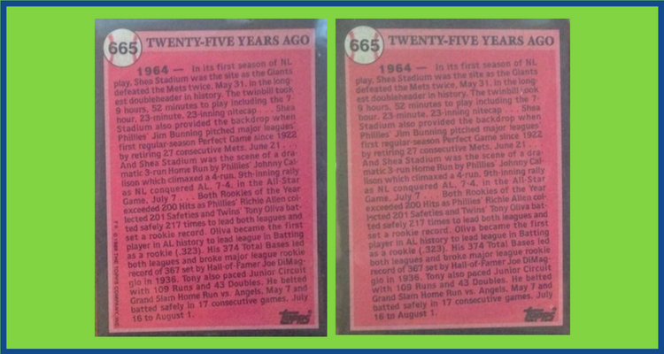
4. Tony Oliva #665
Make Room, Stars Coming Through
Tony Oliva was a heck of a player. Don’t let the Hall of Fame absence fool you. In fact, Oliva could be one of the biggest Hall of Fame snubs in the game of baseball. Just look:
- 8x All Star
- 3x AL Batting Champ
- 5x AL Hit Leader
- 1x Gold Glove Winner
Apparently not worthy of the Hall, but sheesh.
Anyway, Topps thought he was so good that they wanted to remove as many distractions as possible from Oliva’s 1989 Turn Back the Clock card. That includes the copyright text you’re accustomed to seeing on every other card ever made ever.
Here you see it missing from the left side of the card:
5. Stan Jefferson #689
Just Seeing If You’re Paying Attention
Sometimes with these errors, I just think card manufacturers are testing us. I mean, of course we are going to notice profanities scribbled on the bottom of someone’s bat, but would we, say, flinch at a pink or purple triangle printed somewhere on the card?
I have trouble with colors. Not sure if I’m legitimately color blind, but I have tough time picking up on things like this. Still, staring at the card now I’m wondering if I uploaded the wrong image.
Anyway, see for yourself.
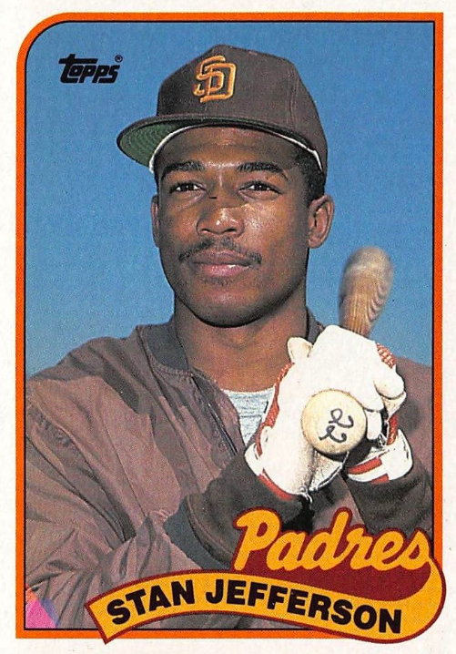
Yeah! Bottom left corner, that pink triangle. There is a purple variation, too.
And poor Stan! That’s one awesome, stoic stance that would make anyone forget you’re staring at a lifetime .216 hitter (coming from someone who would give just about anything to be a career .056 career hitter).
Until Next Time
This is just a small sample of the many errors out there, and in this 1989 Topps set. I mean, check out everything that’s wrong with the card backs, specifically! For a full, comprehensive list, head over to Trading Card Database for some good and complete info.
As always, feel free to comment below!

Ryan Barone (“Ballcard Genius”) is a recognized sports card expert and lifetime collector. With nearly 27,000 TikTok followers and over 3,000 SubStack subscribers, Ryan loves talking cards, dishing tips, and building hobby communities. hello@ballcardgenius.com; Last Time Ago LLC dba Ballcard Genius.